Bee-utiful food packaging design
Honey Bros approached us to help with creating a brand identity that captures their new start-up business. For this project, White Rabbit developed a distinctive logo and food packaging design.
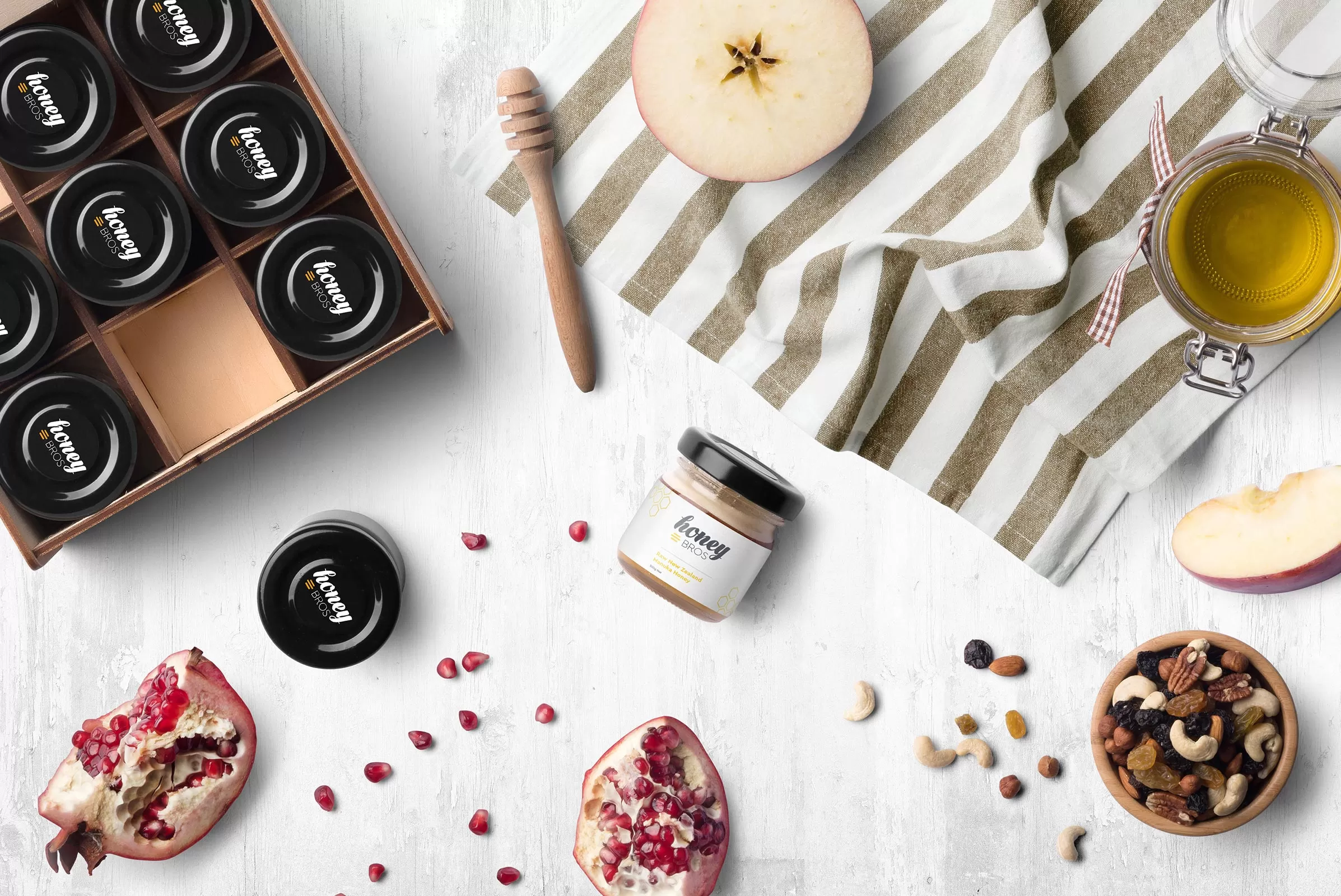
We began the process by researching their competition. We noticed the majority of honey products on the market featured overly busy designs, cartoon bees or looked like they hadn’t been updated since the nineties.
We knew that a contemporary, clean and more minimal approach would not only help their food packaging designs to stand out on the shelves. It would also establish a more premium look for the product.
Inspired by the geometric shapes of honeycomb, we created a simple monoline pattern to incorporate into the design. The white background creates a subtle negative space that supports the strong charcoal and yellow of the brand’s identity in the foreground.
SERVICES

Must be the honey
The logo design for Honey Bros captures the feeling of liquid honey with a custom-made, bold, script style typeface. This is combined with a fresh, contemporary thin typeface to add contrast and establish hierarchy within the name of the company.
We used a simple hive icon to enhance their identity and tie the two typefaces together. While charcoal and white form the foundation for the brand identity colour scheme, the yellow used for the hive icon provides the perfect eye-catching accent for the food packaging design.
The finished logo for Honey Bros is a distinctive and fresh brand identity with a strong visual impact.
When looking for Packaging Design Companies to work with it was important for Honey Bros to find one that could work cohesively across their brand identity and packaging.

Growing into a new art direction
As a new start-up, it was vital their food packaging design presented a polished, professional brand identity. We focused on creating a clear, strong presentation of minimalistic graphics.
The simple geometric pattern added another dimension to the package design and enhanced the identity, adding interest without straying from a crisp, elegant aesthetic.
The yellow and charcoal pop dramatically against white, creating an eye-catching modern effect, giving the product a chance to shine and stand out so anyone who sees it will take notice.