
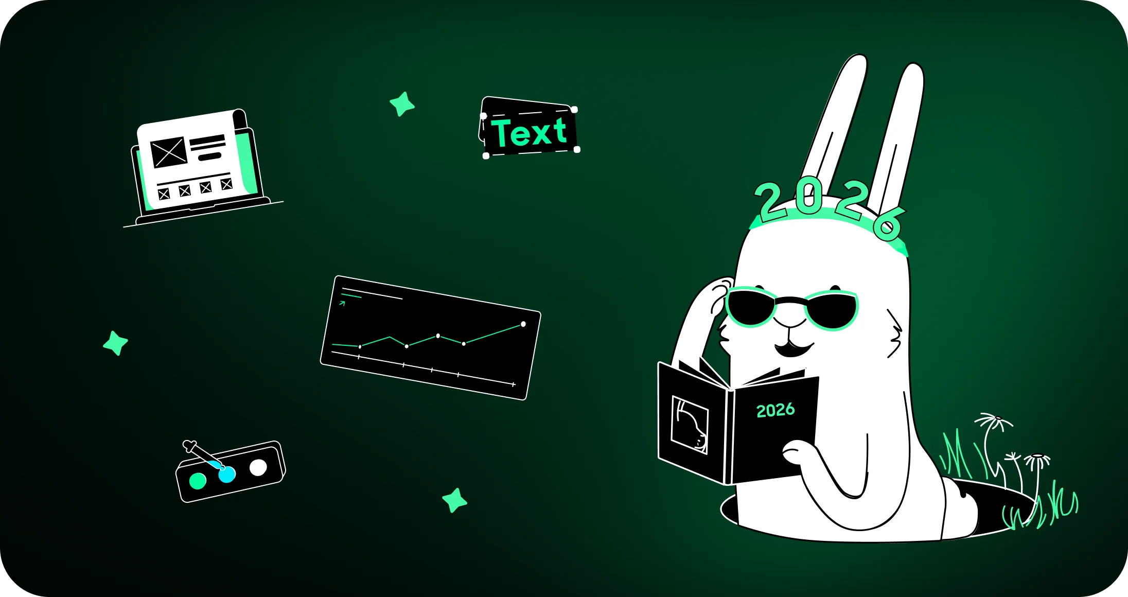
2026 is racing in with a creative collision between AI perfection and handcrafted personality, and small businesses across Aotearoa are already leaning into this wild, expressive mix.
At White Rabbit, we’re seeing more brands wanting visuals that look alive, emotional and unmistakably human — whether we’re crafting website design, logo design, illustration, or packaging. These are the 26 graphic design trends in 2026 shaping the year ahead:
Here’s what we’re seeing take shape in 2026
Liquid glass
Liquid glass is evolving from a UI fad into a full aesthetic movement, as anything Apple does always sets a trend. Soft translucency, frosted blur and glowing highlights create depth without clutter, giving small business websites a futuristic polish that still feels understated. This is great for website design projects where clients want sophistication without going full “sci-fi dashboard.” It pairs naturally with soft neon lighting and minimal layouts, creating interfaces that feel clean but cinematic.
Imperfect human design
As AI-generated visuals flood the internet, humans are intentionally embracing the imperfect. Wobbly lines, uneven edges, smudgy textures and “hand-drawn energy” pop up everywhere from logo design to social graphics. Brands want to show personality again — not machine uniformity — and this trend taps right into that. It’s especially powerful when combined with custom illustration, giving the work the same warmth as something sketched at a café table.
Hyper colour
2026 colour theory is basically: go big, go bold, go neon. Cultural tension often pushes colours louder, and hyper-saturated hues are roaring back with confidence. Historically, when society gets more politically divisive or turbulent, design often swings brighter, more expressive and nostalgic as a reaction – a visual push for optimism, energy and individuality.
Small businesses wanting impact are using colour in unexpected places — gradients, oversized type, packaging, product labels and even subtle UI accents. We’re seeing more clients ask for palettes that feel “fearless,” which fits perfectly into modern branding and expressive layout design. With Stranger Things concluding in 2025, its final season is expected to spark a renewed interest in bold, nostalgic 80s-inspired bold colour pops.
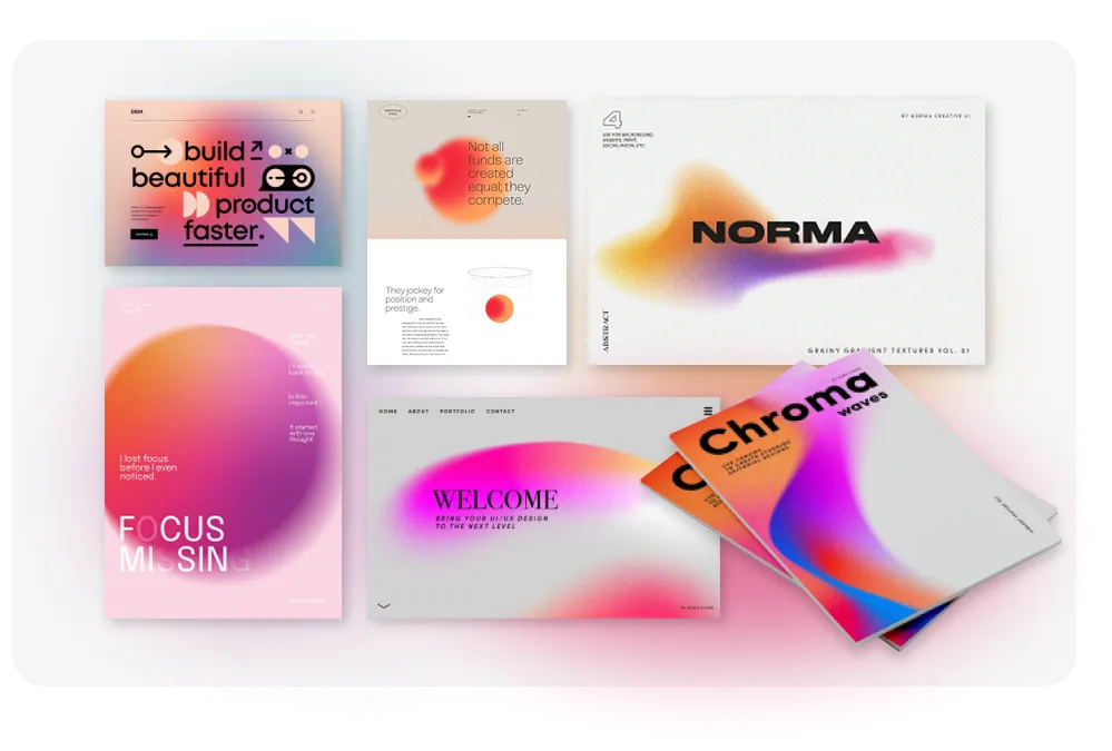
Grainy gradients
Smooth gradients are feeling too AI-clean, so designers are adding grain, haze and nostalgic texture. This subtle noise softens transitions and gives digital layouts a tactile, almost analogue warmth. It works beautifully across hero banners, app interfaces, brochures and booklet covers where you want something modern but not sterile. Our booklet and brochure design projects especially benefit from this dreamy, cinematic finish.
Earthy tones
Earthy tones aren’t new — but 2026 pushes them into deeper, richer territory. Think plum, olive, ochre, clay, rust and muddy blues. These colours create a grounded aesthetic that pairs beautifully with handcrafted type, textured paper and sustainable packaging. Many packaging design clients are choosing these tones to signal authenticity and environmental awareness without leaning into clichés.
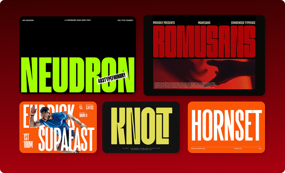
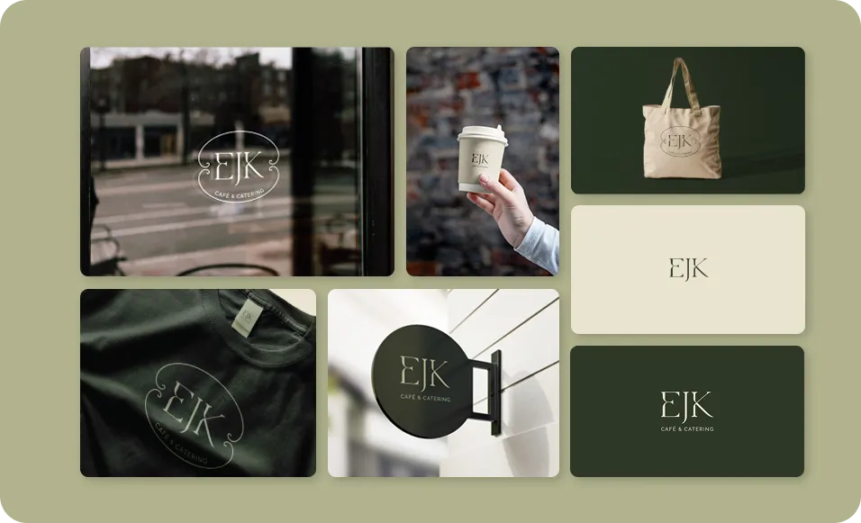
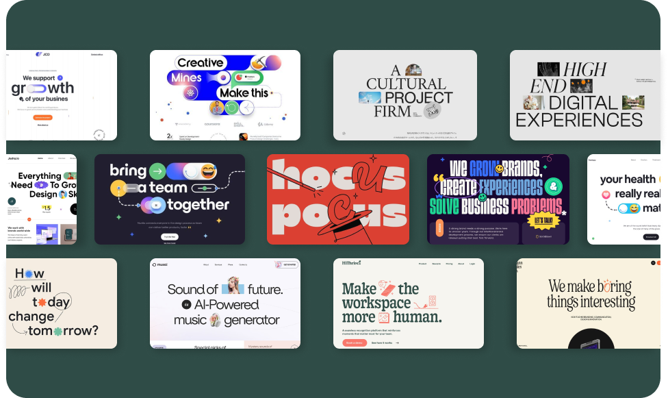
Condensed brutalist sans-serifs
Tall, condensed grotesques are taking over headlines. They’re assertive, clean and modern, perfect for direct communication without losing character. Combined with generous whitespace and minimal colour palettes, this helps brands look sharper and more confident. We’re using these typefaces in digital and print work where clients want strong hierarchy and effortless clarity.
Neo-brutalism
Neo-brutalism brings order, confidence and intentional rawness. Solid colour blocks, visible borders, harsh edges and stripped-back structure form layouts that feel bold but surprisingly usable. It’s one of the best new website design trends 2026 has to offer, especially when paired with motion graphics or soft-rounded typography that keeps the experience friendly.
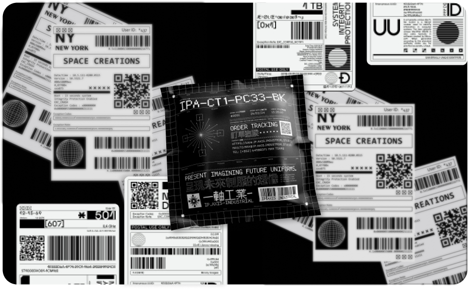
Micro-industrial design
Inspired by engineering marks and technical documentation, micro-industrial elements are all about precision. Small notations, barcodes, micro-grids and label-style typography give work a thoughtful, detail-driven personality. This trend appears in packaging, product launches and even hero sections on websites to signal credibility and craftsmanship.
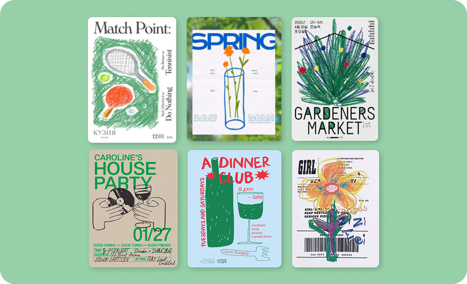
Naive design
Naive design is intentionally simple, childlike and joyfully imperfect. Basic shapes, spontaneous doodles and uneven lines create an inviting brand personality that audiences instantly connect with. This trend thrives in sectors like wellness, hospitality and boutique retail — and works hand-in-hand with the custom illustration style many clients request from our team.
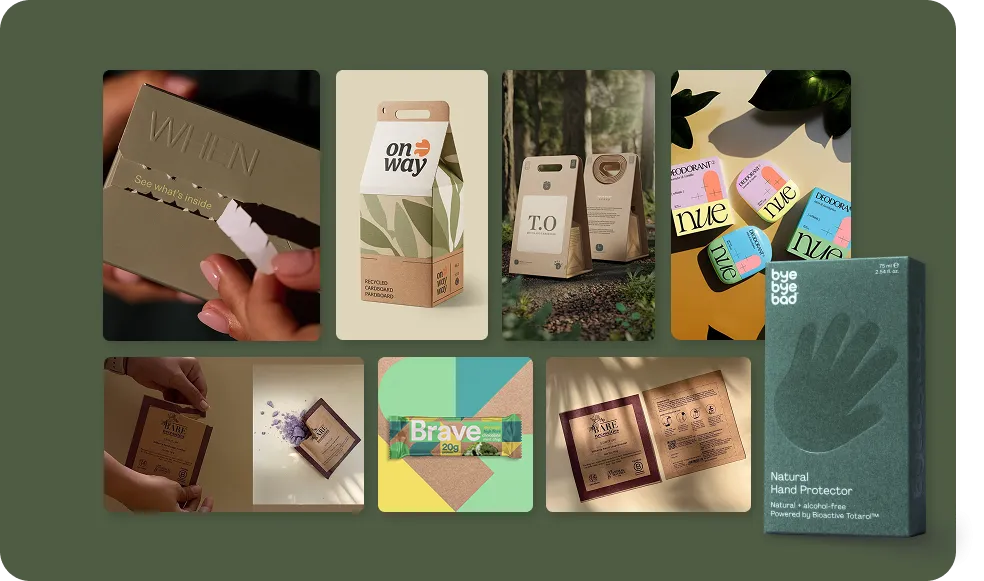
Sustainable packaging
The packaging world is undergoing a transformation driven by regulation and consumer expectation. Recycled kraft, algae pulp, sugarcane fibres, hemp and compostable films are growing rapidly. Structural decisions matter, too: fewer layers, less glue and smarter dielines. Brands want packaging that feels thoughtful, premium and ethical — and our packaging design work increasingly bridges sustainability with strong visual identity.
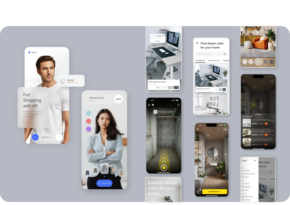
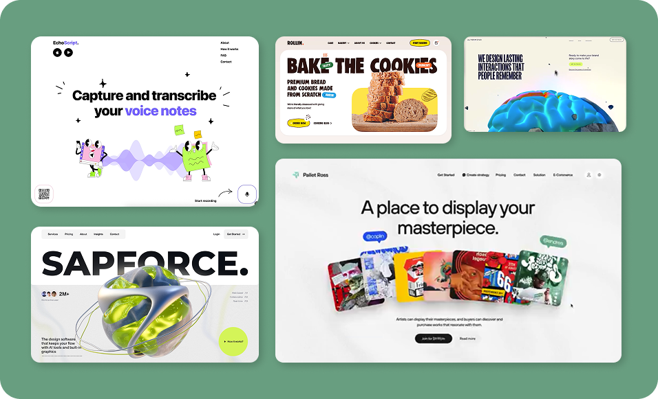
Immersive digital experiences
Modern websites are evolving into cinematic, responsive environments rather than flat, static pages. Interfaces now react in real time, using motion, depth and spatial design to guide attention and create flow. This shift includes dynamic transitions, lightweight 3D and real-world integrations like AR that let users preview products in their own space. When done well, these experiences feel intuitive and immersive rather than flashy. Our website design projects now treat motion and interaction as core storytelling tools, not optional embellishments.
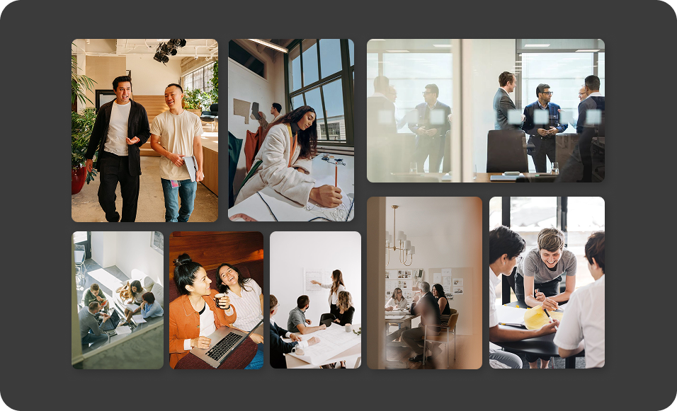
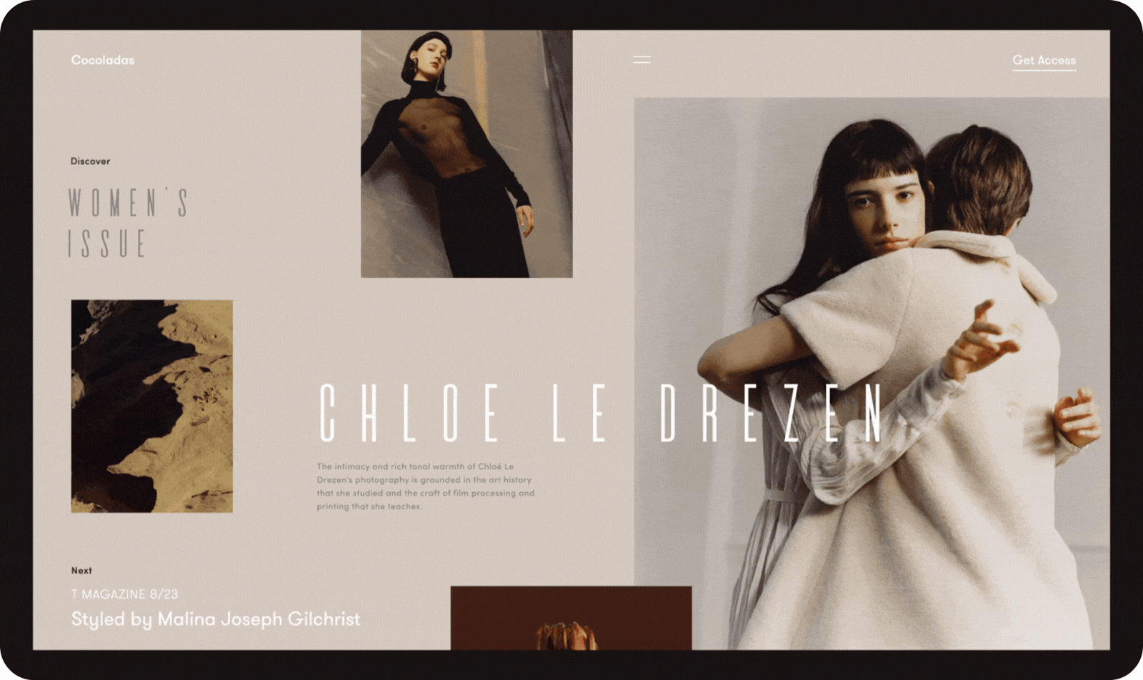
Candid and lo-fi photography
Authenticity is in, staged perfection is out. Photo dumps, flash photography, blurry moments, camera-roll randomness and “caught off guard” energy are dominating branding and social content. This aesthetic works because it feels honest. Small businesses can build trust instantly by showing real people in real moments instead of polished stock imagery.
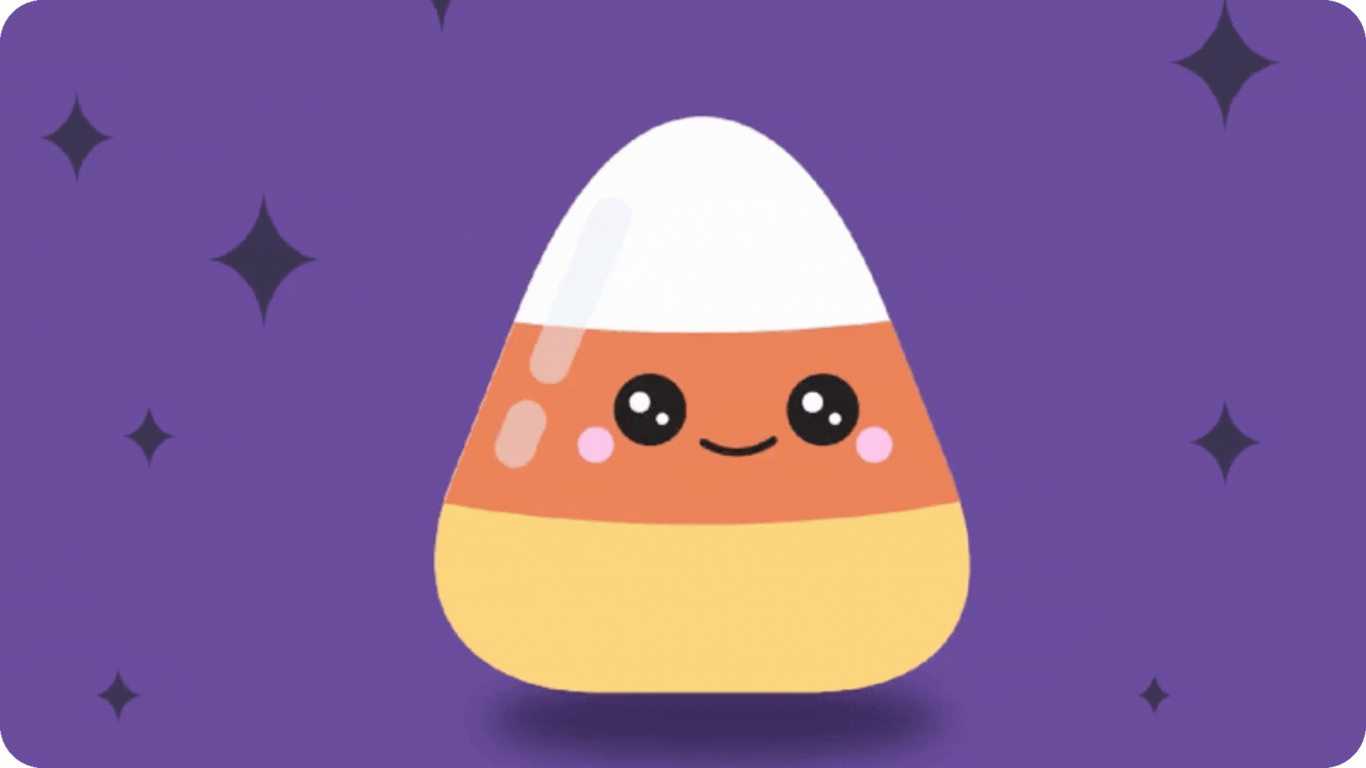
Digi-cute
Inflated shapes, cartoonish 3D blobs, pastel-meets-neon palettes and playful type styles create a joyful chaos that’s especially effective for youth-oriented brands. This trend thrives in social-first environments where personality means everything. It works beautifully alongside quirky mascots, expressive icons and energetic motion.
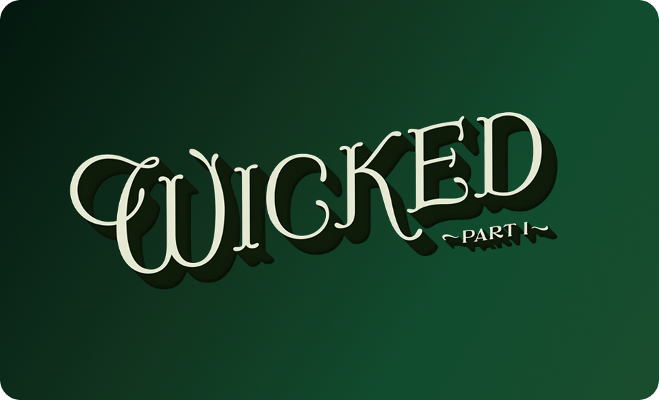
Storybook serifs
Call it nostalgia, call it escapism — but storybook serifs are returning with whimsical flair. These typefaces blend soft curves with sharp details, giving brands an enchanted, literary charm. They appear across wordmarks, packaging and editorial layouts, adding warmth without sacrificing readability. The opening credit sequence for Wicked has only amplified this shift, leaning unapologetically into fairy-tale nostalgia through lettering inspired by the original Oz books — a reminder that typography can carry narrative, emotion and world-building all on its own.

Voice user interface (VUI)
Voice-first interfaces are reshaping how people interact with digital products, pushing brands to think beyond screens altogether. As assistants, smart devices and in-car systems become more conversational, tone, pacing and personality matter as much as visuals. Well-designed VUI feels natural and human, guiding users through tasks without friction or overload. For brands, this means designing not just how things look, but how they sound — creating experiences that feel intuitive, responsive and distinctly on-brand.
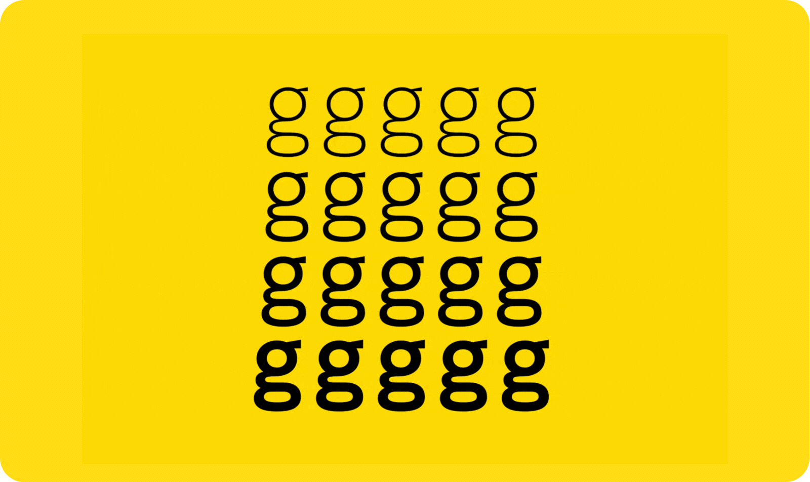
Variable fonts
Responsive typography is a major part of new website design trends 2026. Variable fonts allow brands to adapt type weight, width and optical sizing dynamically. They load faster, animate beautifully and deliver cleaner visual flow across screens — perfect for a polished, high-performance digital presence.
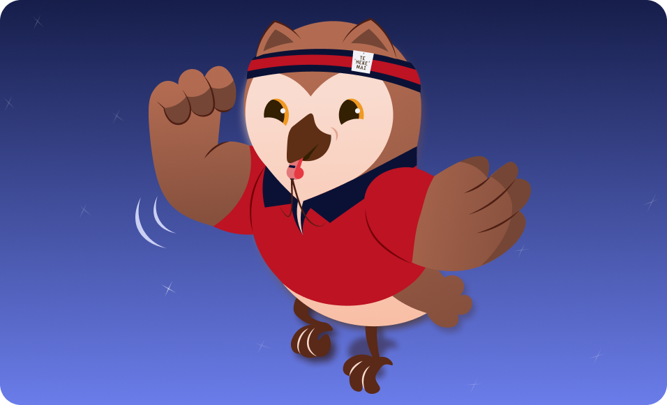
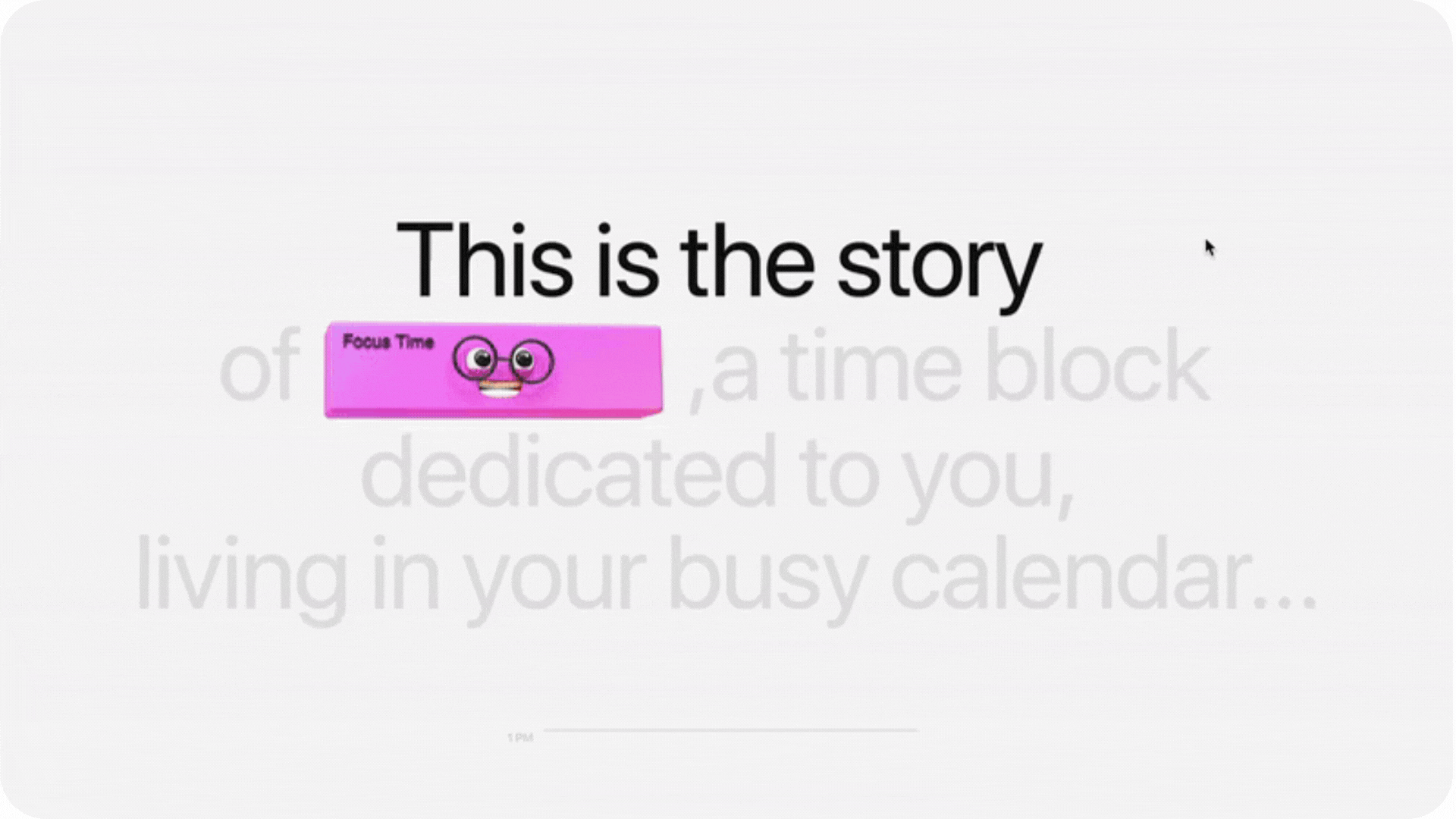
Mascots and illustrated characters
Brands are embracing mascots again because nothing builds emotional connection like a character with personality. These illustrated “blips,” blobs or creatures make brands instantly recognisable and inject charm into everything from packaging to digital interactions. It’s especially effective across business branding that needs a sense of story. There are many successful examples of business mascots, such as Ruru – the Morepork, who we brought to life to guide people through a CV and cover letter builder, creating playful engagement.
Shape-shifting type
Motion as default
Static visuals are becoming the exception. Micro-animations, kinetic typography and scroll-triggered transitions bring layouts to life and make brands feel modern. This movement-first approach is something we’re integrating deeply into website design because audiences expect interfaces that feel responsive and alive.
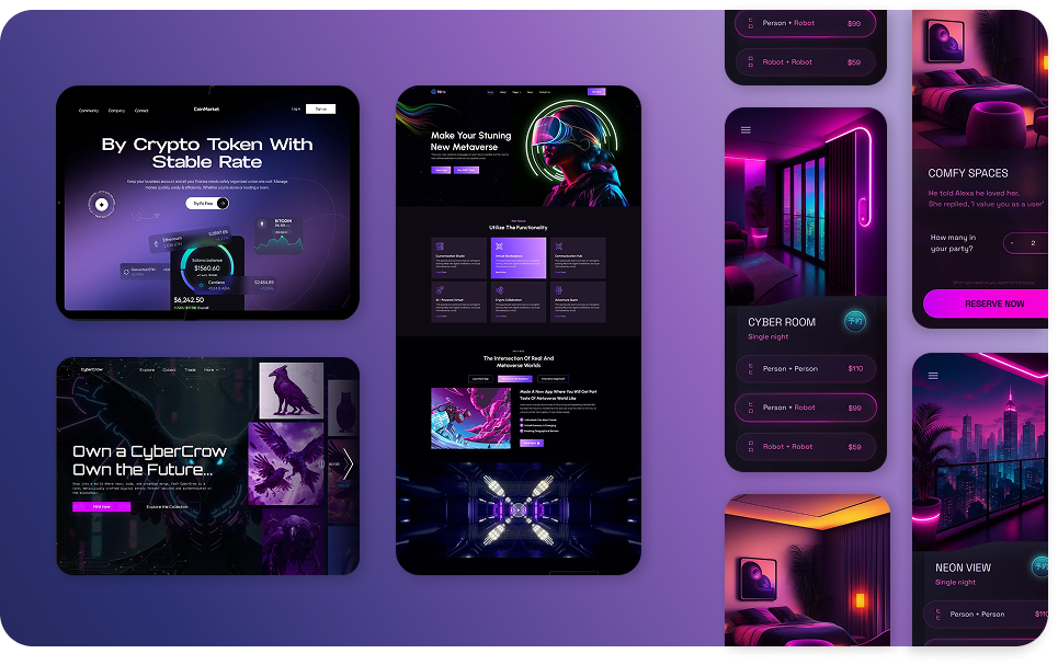
Cyber neon
Glowing strokes, holographic accents, dark interfaces and sci-fi-inspired depth create a futuristic intensity that audiences are gravitating toward. Think dark backgrounds lit with electric blues, purples and greens, floating 3D elements and subtle motion that feels lifted straight from a cinematic interface.
As AR and spatial computing move into the mainstream, this cyber-neon visual language is becoming a natural fit for tech-forward brands that want sharp, energetic identities. Sleek, glowing, sci-fi-inspired visuals are set to dominate 2026 as audiences become increasingly fluent in the futuristic aesthetics popularised by major films and streaming series.
Micro-fiction copywriting
Tiny story fragments offer emotional impact in one to three sentences. Instead of long paragraphs, brands are sliding these snippets into packaging, hero sections and social graphics. It’s storytelling distilled into a spark — short enough for attention spans, meaningful enough to stick.
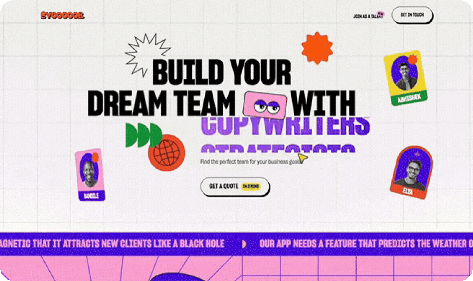
Floating callouts
Designs are intentionally layering annotation bubbles, drawn arrows and tooltip-style notes directly into the composition. It feels transparent and delightfully messy, like the audience is peeking behind the curtain. This trend suits brands with playful energy and works well with modular and deconstructed layouts.
Modular layouts
Modular design uses rearrangeable content blocks that stay consistent across platforms. It keeps branding tidy while allowing creative flexibility. We use this style frequently in brochure design, booklets and digital brand systems because clients can expand their content effortlessly.
Deconstructed grids
Structured chaos is trending. Designers are intentionally breaking the grid by shifting elements off-axis, scattering compositions and layering content in ways that still remain clear and readable. These looser layouts feel more human, creative and energetic than rigid systems, helping brands stand out in fast-scroll digital environments.
This kind of “structured chaos” naturally draws the eye while preserving hierarchy, making it easier to guide attention without feeling formulaic. It also mirrors a broader cultural shift online — audiences are craving personality, movement and visual expression that feels less controlled and more alive.
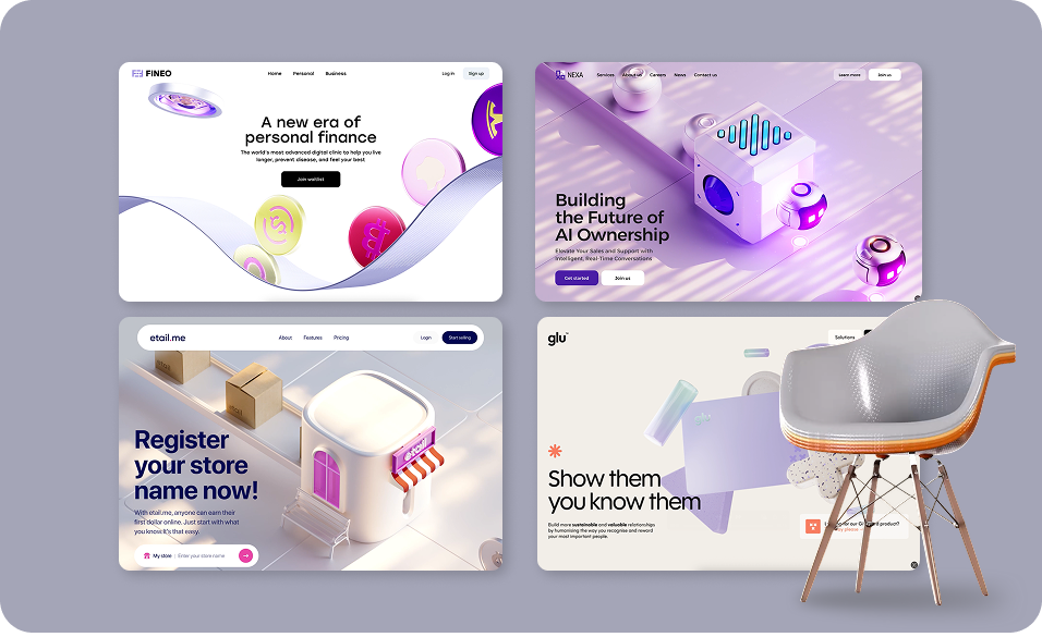
3D everything
3D is no longer specialist territory. Brands are using 3D objects, icons, typography and ambient scenes in social content, websites and product promotions. With better tools and lightweight assets, even small businesses can achieve cinematic visuals without blockbuster budgets.
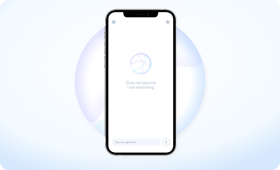
AI chatbots & smart assistants
AI-powered chatbots and smart assistants are becoming a core part of modern digital experiences rather than a novelty feature. When designed well, they boost customer engagement, streamline enquiries and remove friction from the buyer journey. From answering common questions to guiding users toward the right product or service, these tools work quietly in the background to improve conversion rates. For many of our clients, integrating a smart assistant into their website is a practical way to enhance usability, support customers in real time and scale their digital presence without adding complexity.
Ready to upgrade your brand for 2026?
If your business is gearing up for a visual change, now’s the perfect time to hop ahead of the competition. The brands winning in 2026 are the ones embracing bold colour, expressive type, handcrafted detail and digital experiences that feel alive — and we help New Zealand businesses bring that to life every day. Explore our work to see how we elevate brands across Aotearoa, from identity to digital and everything in between.
These trends aren’t just about looking current — they’re strategic tools that help your business stand out, connect and grow with confidence. If you’re ready to give your visuals a forward-thinking edge, hop over to our contact page and let’s create something unforgettable together.