A negative space logo with spark
After years in business and being a staple in the sports broadcasting community, Volt TV was in desperate need of an updated image. While it was the ideal moment to reinvent themselves and update their look, it also involved staying true to their values and existing customers. They engaged White Rabbit for the transition.
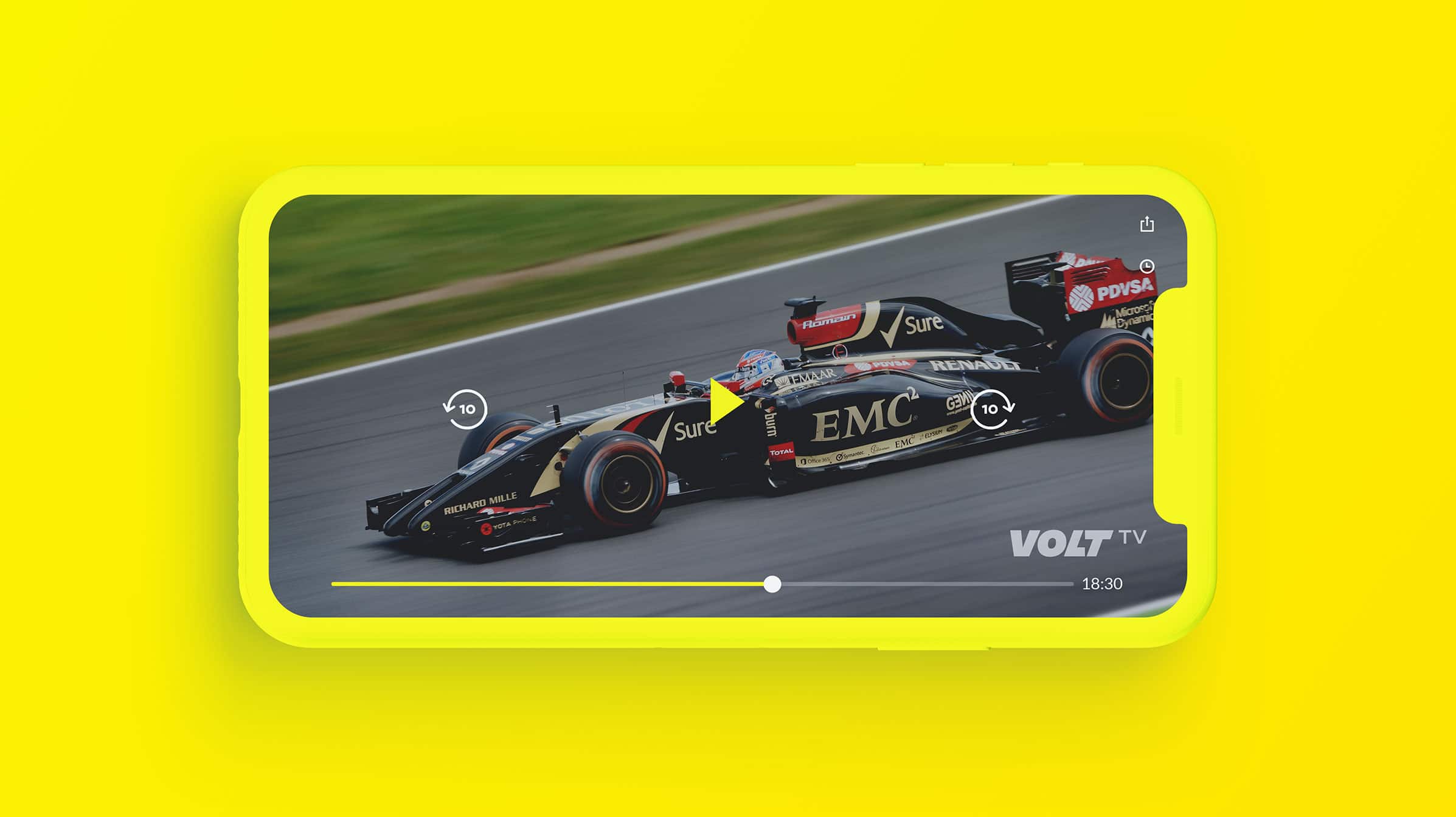
The new logo needed to show action, look good in a small corner on a TV screen and we were keen to keep a lightning bolt in the design to pay homage to the original version. We used a negative space logo design to implement this in a more subtle and clever way.
SERVICES
- Logo Design
- Business Cards
- Letterhead
- Promo


Reflecting the Volt TV brand
Our graphic design agency highlighted something unique to the brand – a lightning volt which also helps for clients and customers alike to make a connection to the brand’s name. Implementing this within a negative space logo married the type with the icon in an effective way. Not only is it a point of difference, it also highlights the spark and energy behind Volt TV.
A bright yellow was introduced as a brand colour to reflect the vibrancy and culture of Volt TV’s broadcasting.


Adding a suite collateral of company materials
Once we nailed their clever new logo design, we moved on to help with their other in house collateral. We created a great deal of materials including business cards, letterheads, t-shirts and many more to activate their brand and continue attracting new and existing customers.


