Peaking on the success of logo and consultant stationery design
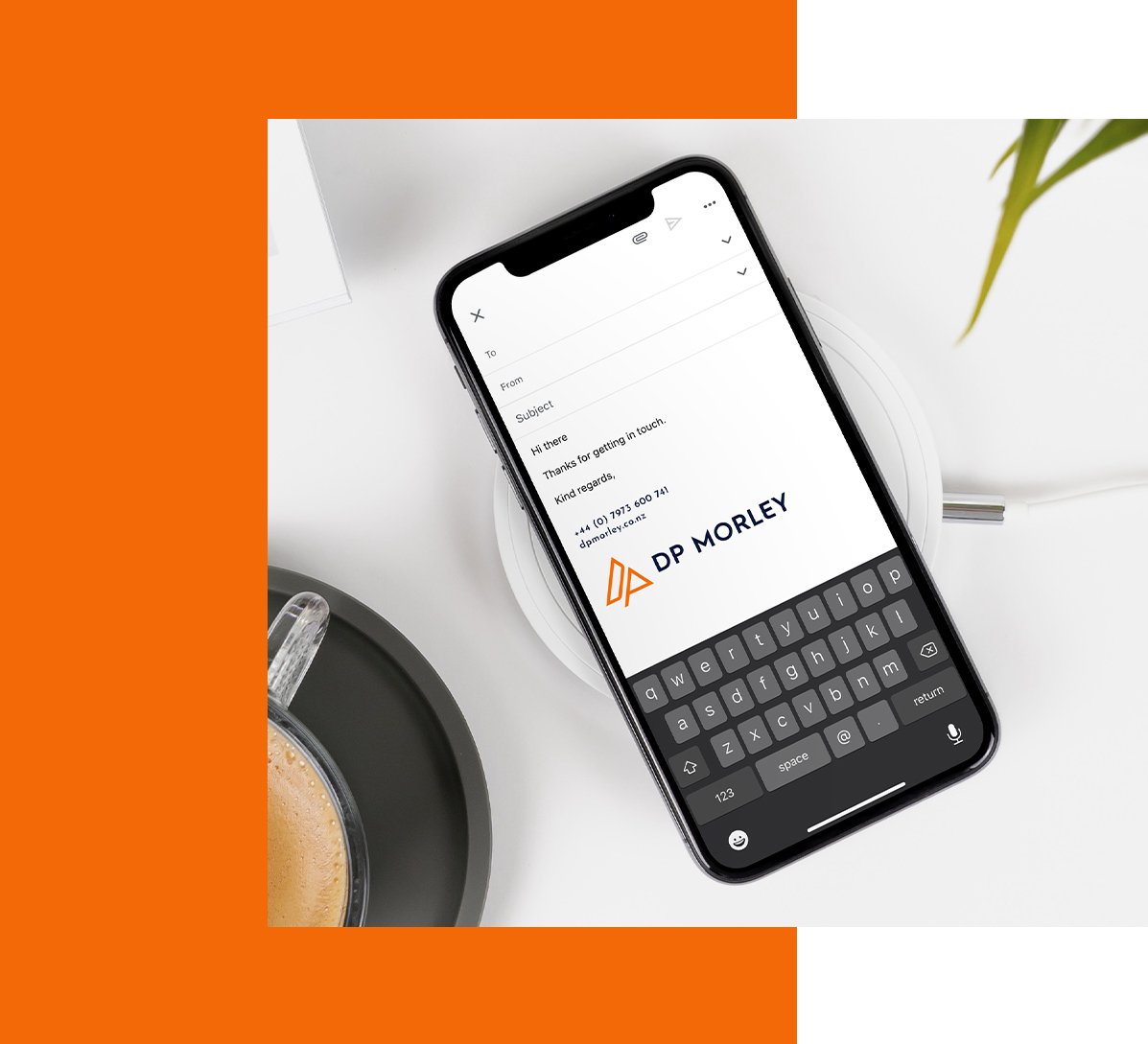
DP Morley, a business consulting company sought our expertise in designing a logo, business card, email signature and website to reflect their professional and friendly nature. As a company that’s been in the industry for many years, they wanted to have an inviting and professional first impression on potential clients.
To achieve this, we created a triangle logo design. We combined the initials “D” and “P” to create a simple and minimalistic triangular logo mark, symbolising stability and growth. The selected colours of orange and navy convey enthusiasm, energy, and professionalism, creating a visually appealing contrast that catches attention. The D and P logo is versatile and memorable, making it easily recognisable across the consultant stationery design we created.
We carried across the branding elements to the design of the email signature, business card and website. The consultant stationery design consists of the strong palette of orange and navy along with a clean sans erif font to highlight details. The website design contains a sleek layout and bold headings for legibility. The overall collateral created along with the triangle logo design produces a strong first impression to achieve the goals of D P Morley.


