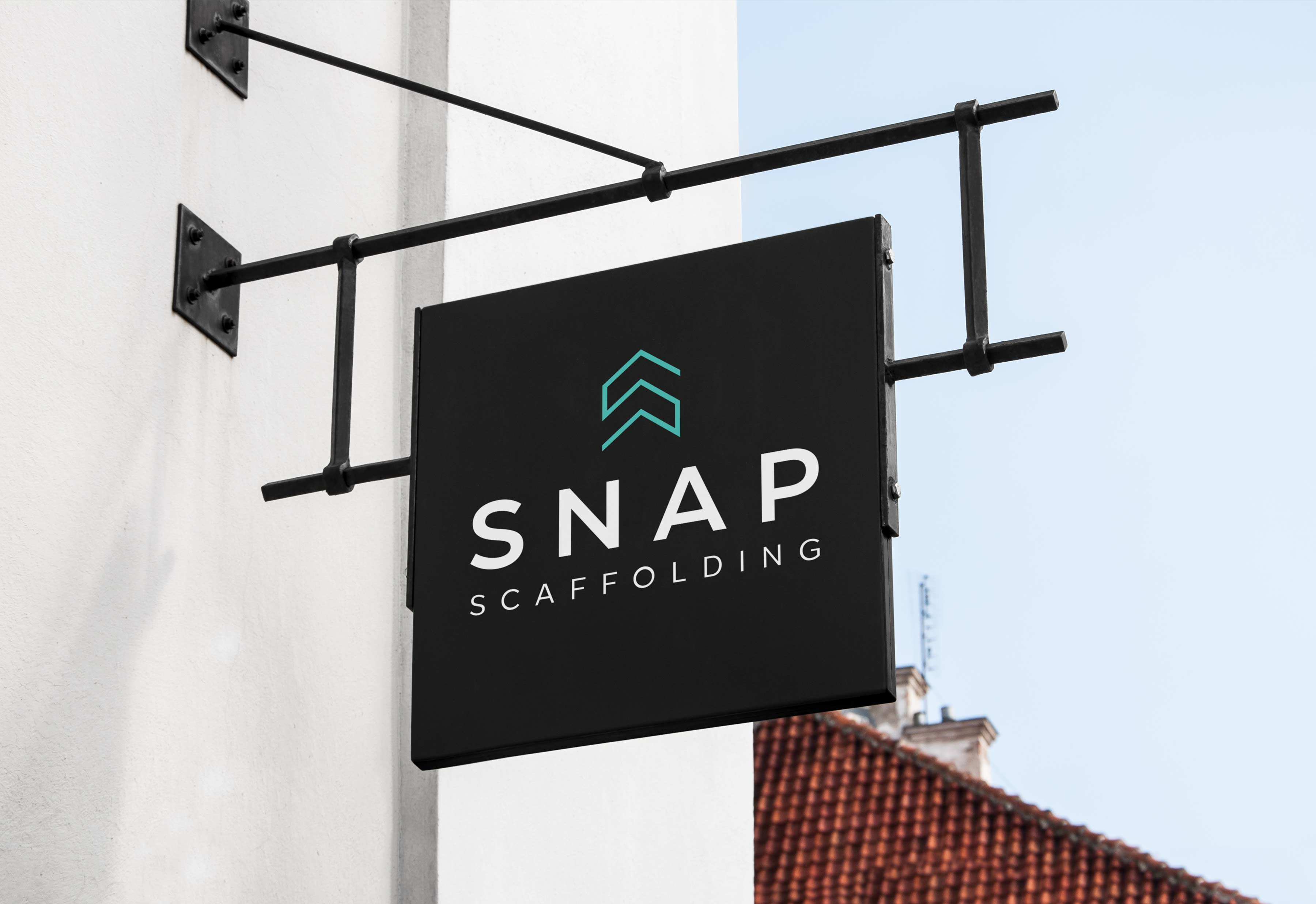
Building a solid brand identity with an S logo design
Snap Scaffolding is a team of efficient and energetic professionals who specialise in high-quality scaffolds for residential construction and industrial facilities. They were after a logo design company to reflect what they do and resemble their energetic nature. Inspired by the world of scaffolding, our designers crafted a logo that was both clean and energetic. The clever use of the letter ‘S’ allowed us to create a building shape, which we then added a fold-like effect to give it a 3D look. We complemented the logo mark with a modern typeface that emphasised the professionalism of Snap Scaffolding.
To give the brand a fresh and dynamic feel, we chose a colour palette of black and green. We applied this palette to all the brand collateral, including business cards, email signature, and letterhead. This consistency helped to create a cohesive and recognisable brand identity for Snap Scaffolding.
SERVICES
- Logo Design
- Email Signature
- Business Cards
- Signage
- Letterheads
- Promo


