Hot pink logo for a cool, trendy, and high-quality periodontal practice
Capital Perio wanted the design of their new logo to reflect the standards of quality they provide, i.e., excellent, modern treatments in a caring, friendly, calm, reassuring, and welcoming environment.
The logo we created has a circle at its centre, representing the care that Capital Perio provides. The line under the circle symbolises gums, with the overall effect being a stick figure hugging a tooth. When it comes to standout logo design in Wellington, our design agency is the perfect choice for businesses looking to differentiate themselves from the competition. Our work for this particular practice captures, at a glance, the type of services they provide, with a fun and distinctive style that sets them apart. Trust us to create a logo that will make a positive impact and help your brand stand out in the crowded Wellington market.
From modern tooth logo design to professional business card creation
We carried the brightness, trendiness, and vibrancy of the logo through to the new business cards we designed, using a vertical orientation to differentiate the brand, attract attention, and leave plenty of space for listing contact details.


Dental industry branding, logo, and marketing material design
As part of this branding and marketing material design project, we also created two trifold brochures. The aim was to educate patients about gum health and the treatments available, which we achieved through a clean typeface and the brand’s new, vibrant colours. Our brochure design services in NZ are second to none, and with this brochure, we helped Capital Perio to effectively communicate its message to its audience.


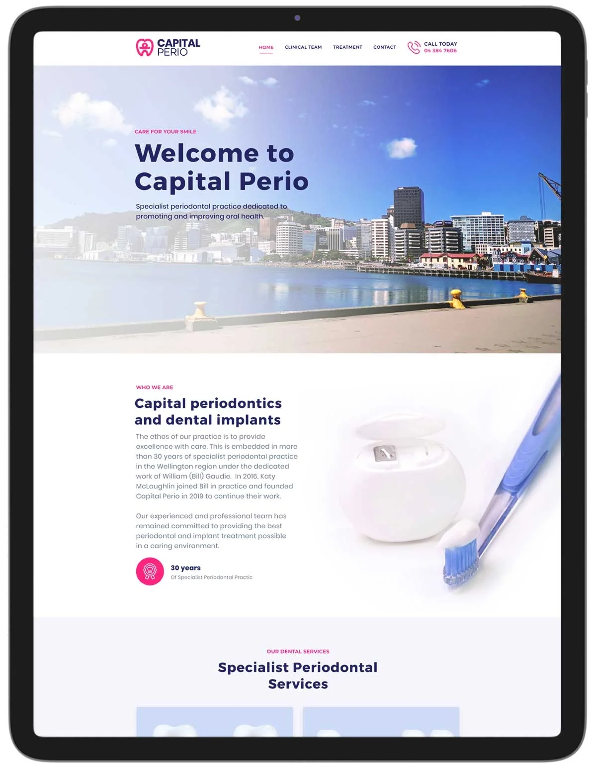
Engaging, vibrant, and professional periodontist website design
Part of creating the brochures also involved the development of 3D illustrations to inform patients about the conditions that Capital Perio treats, and the treatments that are available. We continued the use of brand colours in these illustrations to ensure consistency.
The illustrations were also used on the company’s new website, which we also created. The new site is engaging and informative, with a clean, bright, and easy-to-navigate layout that retains the same consistency in brand design. Our website design services in Wellington ensure that Wellington businesses are equipped with beautiful and user-friendly sites.

