Those who hop together achieve top success together
The recruitment space is crowded, so it’s important to have job recruitment branding that gets your company noticed above the rest. This was the priority of our design agency when the team at Frog Recruitment approached us to design their new logo. Using a frog element in the design was the obvious choice, but we didn’t want it to be any old frog cliche. Our team of experienced logo designers in Auckland created a standout design that met all of their branding needs.
Instead, our aim was to make the new logo fully represent the fast-paced nature of Frog Recruitment’s ethos. We also wanted the logo to reflect how the company helps businesses accelerate growth through the acquisition of talent, as well as how it supports individuals as they develop through their careers to achieve ongoing success.
SERVICES
- Logo Design
- Signage
- Brand Guidelines


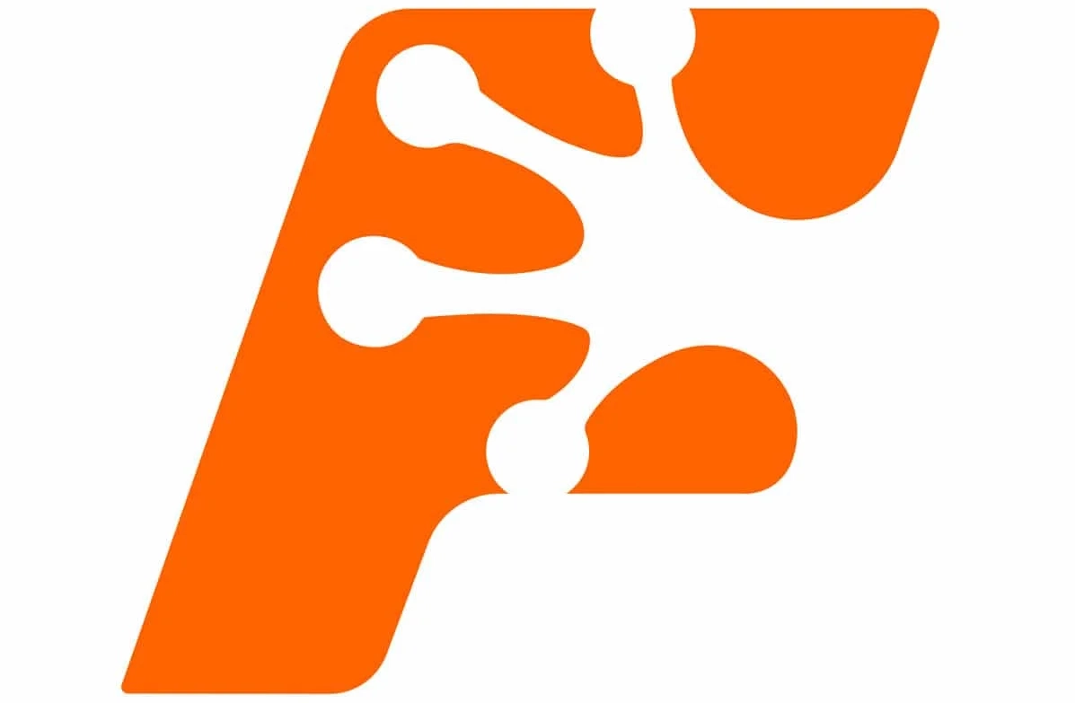
Negative space frog logo
Starting with the letter “F” in the company name, our designers used negative space to create an image of a frog’s foot within the letter. This unique design is both creative and memorable.
To generate the appearance of movement, we put the word Frog in italics, using a large typeface for the four letters that also adds symmetry to the overall design. The word Recruitment appears below with a smaller typeface.
BEFORE

AFTER


Orange and blue logo design
For the colour scheme, we used a vibrant orange as the primary colour with a softer and approachable navy as the supporting colour. The result is a logo that looks fantastic in multiple variations and on different media elements.
We also created new branding guidelines for Frog Recruitment based on the new logo, ensuring consistency across all touchpoints.


