Generating leads for this property valuation website with form design
The Virtual Appraisal is a web-based tool that allows homeowners in New Zealand to find out the current market value of their homes quickly and easily. In the process, they can also connect with the best local real estate agent in their area. The process for homeowners involves completing a form on The Virtual Appraisal website. They will then receive replies from local estate agents with details of their home’s value and other information on selling their home.
So, the importance of the form on The Virtual Appraisal website cannot be overstated. It has to be welcoming and visually attractive, and it has to encourage people to fill it out. It also has to prevent dropouts with a simple and easy-to-understand form filling process.
SERVICES

Form design for online real estate appraisal sites
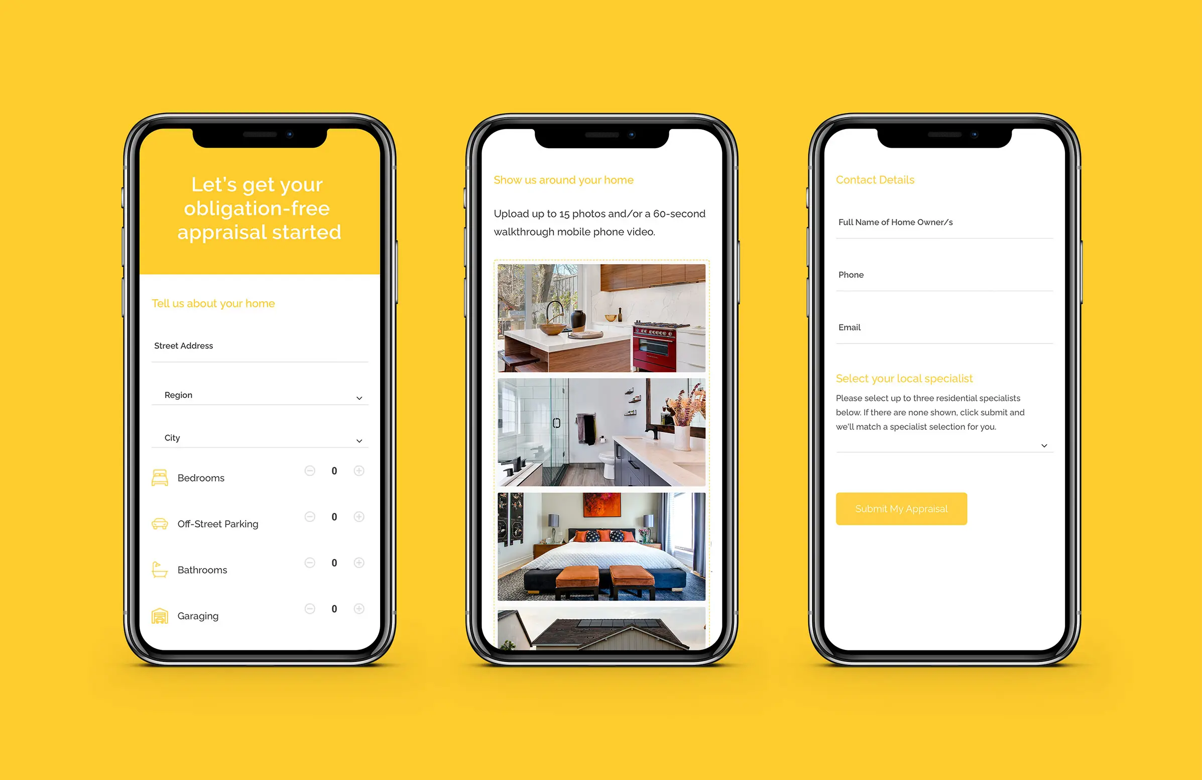
We’ve got a good reputation for producing world-class graphic design in NZ. Our experience and expertise in form design put us in an excellent position to create a form that would meet the main requirement of The Virtual Appraisal – maximising lead generation. A lot of information needed to be gathered in the form, however, so we created a step-by-step design to make the process intuitive and clearly explain what the user should do next. The step-by-step structure also simplified the process of completing the form and made sure users were not overwhelmed with too many fields to complete at once.
We also made the various elements of the form simple to use by ensuring the user had as little to do as possible. This particularly applied to minimising the amount of typing the user had to do. Where we could use dropdowns and radial buttons, we did.

Minimalist design that looks great on all devices
In terms of the styling and design, we matched the colours used in the form to the colours of The Virtual Appraisal’s brand. This primarily involved using the brand’s yellow colour for the button, section headings, and icon. The icons added creativity to the form, helping to make the form visually appealing rather than purely functional.
We also used thin stroke lines on the various elements, as well as ensuring there was plenty of white space. This enhanced the design, whether it is viewed in full-screen mode on a computer or when the various elements of the form are staked for viewing on mobile devices. The generous use of white space also made it easy to interact with the form using fingers. To discuss your requirements for form or home appraisal website design, please get in touch with us at White Rabbit.