Adding a shot of innovation to the minimal gin bottle design
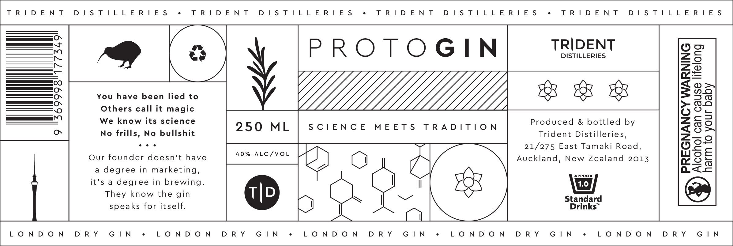
Trident Distilleries is a small craft distillery specialising in gin production. They approached our design agency to create a premium and handcrafted gin packaging design that reflects their tagline, “science meets tradition”. We crafted a series of illustrations that blend handcrafted and monoline styles, inspired by the ingredients and flavours used in their gin. These illustrations add a unique and visually appealing element to the gin bottle label design.
To create a scientific touch, we incorporated patterns and laid out the content in a distinctive grid format. We carefully selected a sleek typeface that complements the overall aesthetic of the best gin packaging. The hot pink and bright green colours were used to distinguish the flavours, kaffir lime and rhubarb. This conveys a sense of vibrancy and excitement, capturing the essence of the unique flavour profiles of the product. The minimal gin bottle design sets their product apart from competitors and conveys a sense of quality and craftsmanship. We then carried the packaging and branding elements across to the digital space creating a seamless experience to browse through the products.
SERVICES