Bottling brilliance for a modern beer brand identity
Brick Road Brewing is a cutting-edge beer brewing company that is set to make its mark in the craft beer industry. As the company approached our design agency to design its logo and brewing kit packaging, we knew we had to capture their essence, which would be iconic and adaptable. The beer logo design features a bold, modern slab typeface. The words are contained in a sleek black rectangle with round corners to create a brick shape. This is a nod to the company name that will add memorability. The brick shape can be further used as a versatile brand motif to further support the branding.
One of the key features of the logo design is its versatility. The various lockups allow the logo to be adapted to any size and visible on any background, making it a flexible design that can be used across different mediums and platforms. To polish off the design, we designed the hops brick icon to support the brand and be a recognisable mark in the industry.
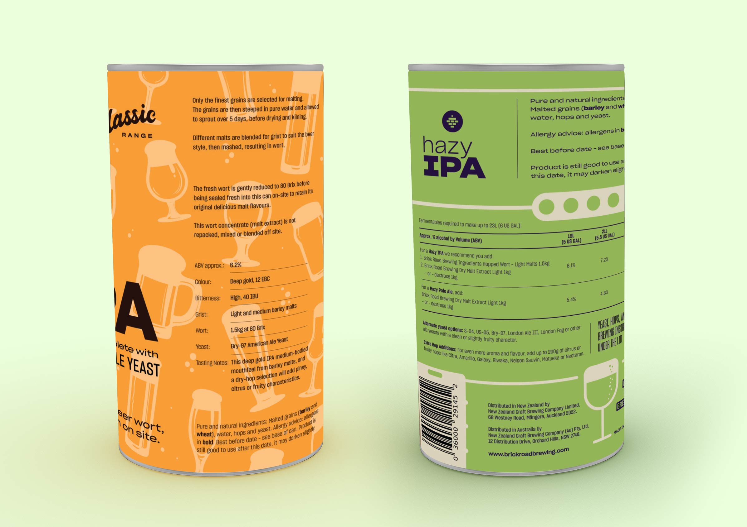
In addition to designing the logo, Brick Road Brewing also approached us to create packaging for their brewing kits that would be as unique and captivating as their brews. The beer packaging design features a series of illustrations that reflect the client’s adventurous spirit and commitment to pushing boundaries. One variant showcases the brewing process, from measuring ingredients to bottling the finished product, creating an engaging visual narrative that captures the essence of the brand. The vibrant green chosen symbolises freshness and vitality, while the energetic orange represents creativity and innovation. The two colours work harmoniously together, creating a visually striking and memorable look on the shelves with the modern drink logo.
SERVICES