Finding calmness through a heart and leaf shape logo
Mind and Me is a health food company that prioritises wellbeing by offering superfood blends designed to combat the effects of stressful lifestyles. Our bunnies in the Auckland design agency are all about inner health and balance so it was the perfect opportunity to design a superfood company logo that reflects this passion.
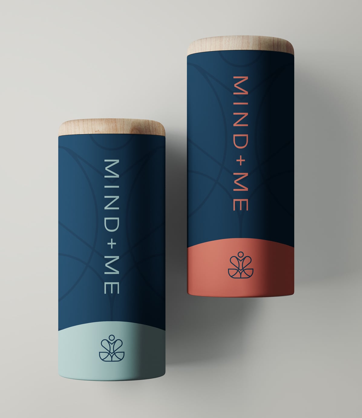
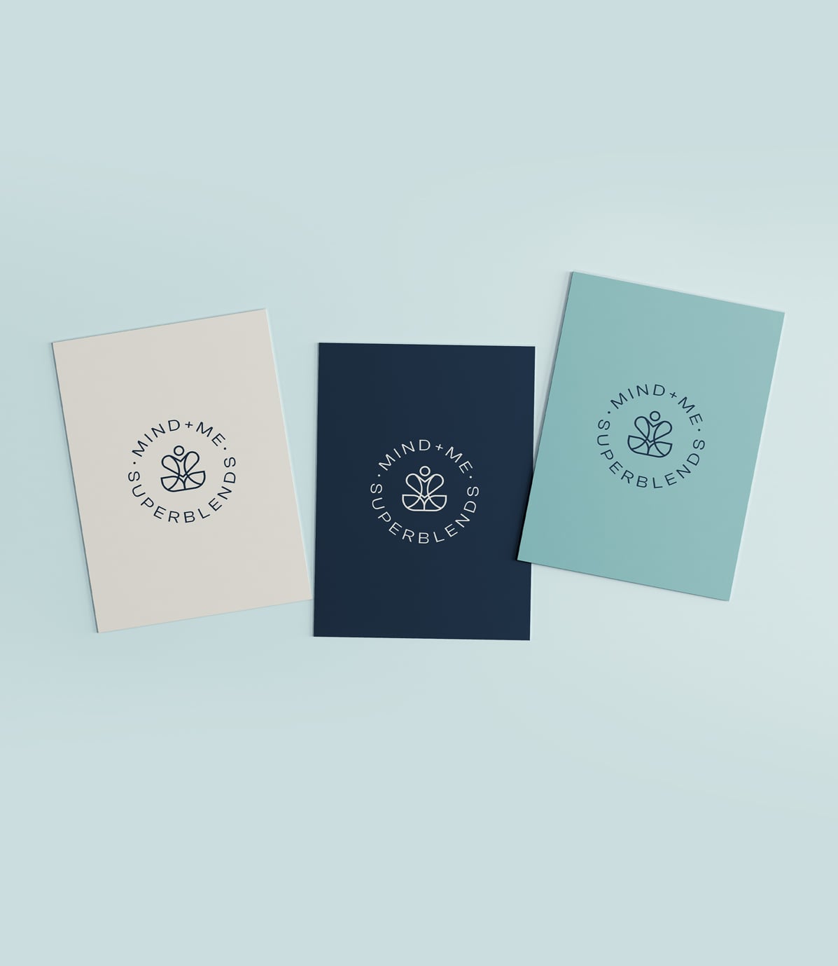
We were tasked with designing their logo and creating a one-sheet guideline that encapsulates the brand’s values. The logo design merges several elements into a distinct logomark. The design features a heart shape to represent health and vitality, two leaves at the base symbolising healthy food, and a circle suggesting an abstract head. This heart and leaf shape logo combination forms a person in a meditative stance that signifies balance and cleverly incorporates two abstract ‘M’s within the heart shape and between the leaves.
The primary navy palette lends the brand a premium, classy look, while the professional sans-serif typeface reinforces its approachable identity. The overall design effectively communicates Mind and Me’s commitment to fostering a healthier, more balanced lifestyle.
SERVICES