Crafting a spray painting company logo with a unique touch
Auckland Spray painting & Polishing is all about transformation—whether it’s giving a kitchen a fresh coat of colour or restoring a cherished piece of wooden furniture. They approached our Auckland design agency to craft a spray painting company logo and business card that reflect the quality, trustworthiness, and revitalising touch they bring to every project.
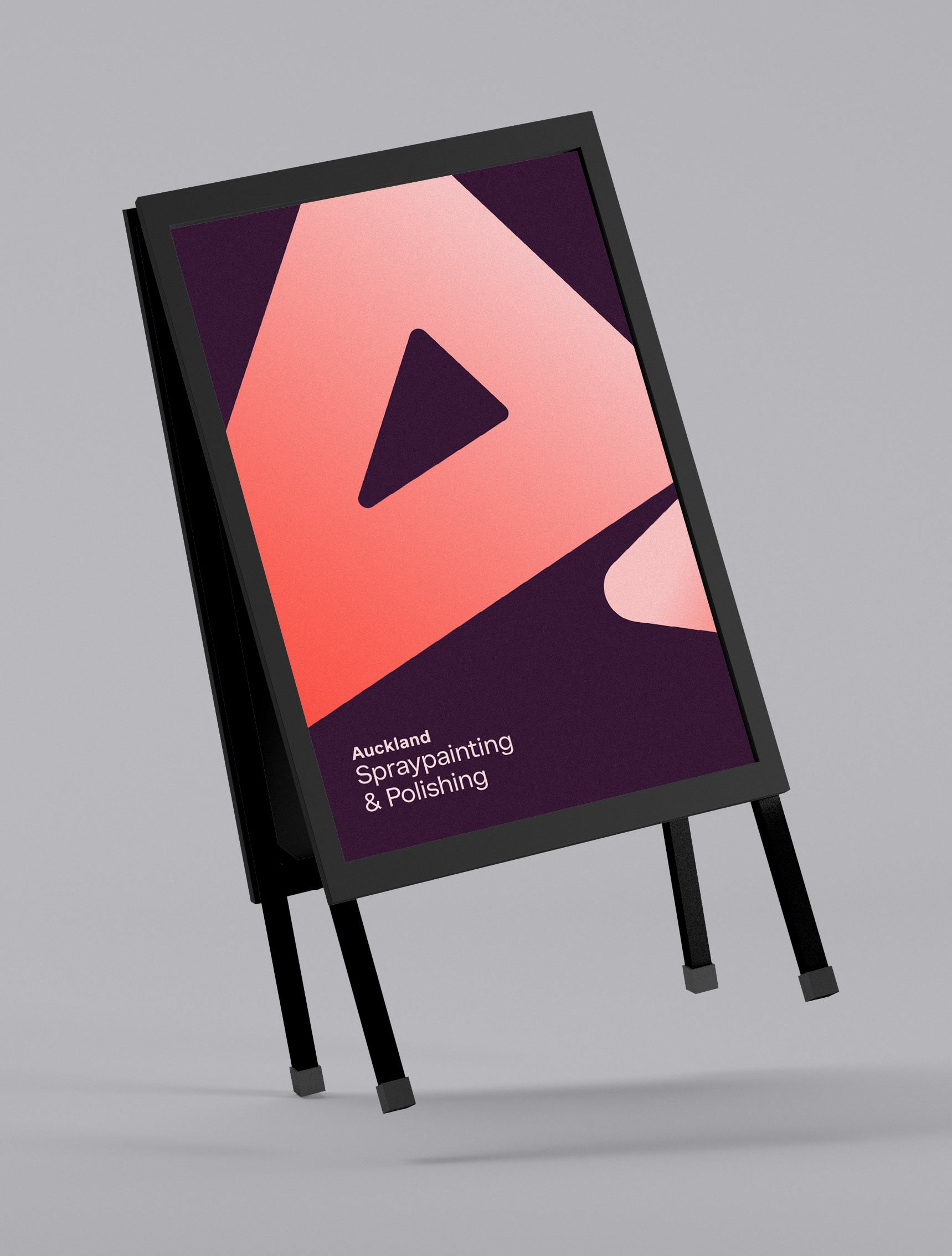
For the logo, we crafted an icon inspired by the shapes of spray paint coming out of a can, creating a dynamic and memorable connection to the brand. The geometric typeface is modern, ensuring readability while reinforcing the contemporary feel of the brand. We opted for a bold colour palette with a distinctive gradient, steering away from the common blue tones used by competitors. This unique gradient logo design subtly represents the transition from old to new, mirroring the company’s commitment to renewal and quality.
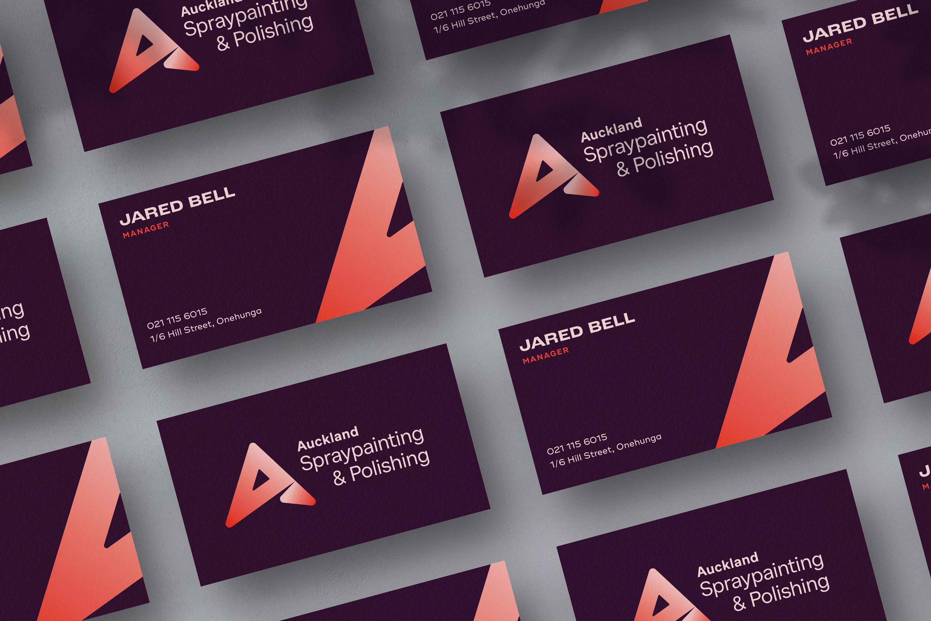
For the business card, we continued the professional design approach, ensuring the strong colour palette from the logo was carried through seamlessly. The red and purple business card contains plenty of white space to ensure the details and logo stand out. This cohesive branding ties together the visual identity, making a lasting impression in every interaction.
SERVICES
- Logo Design
- Business Cards
- Promo