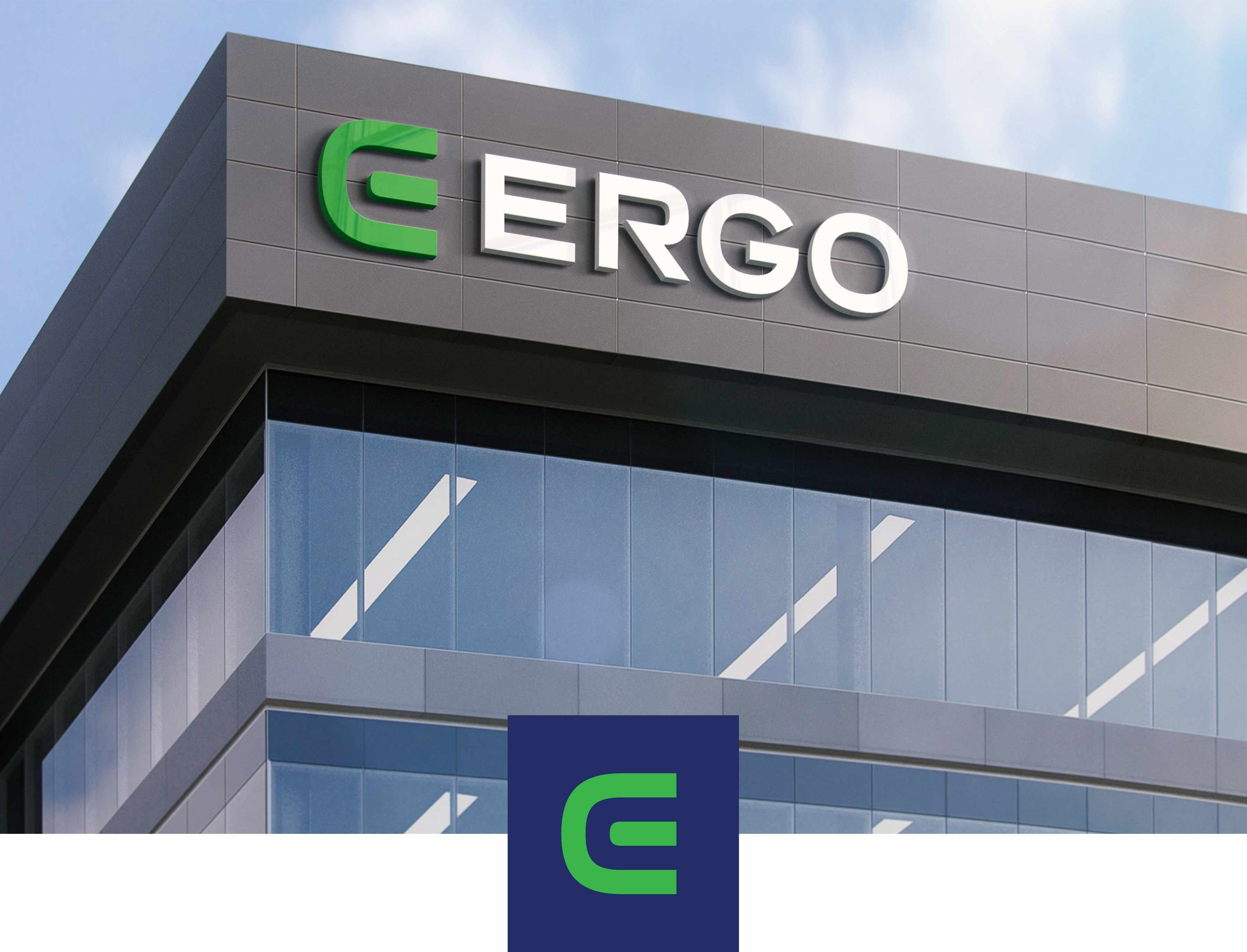
Empowering the brand with a modern, green E logo and a website revamp
Ergo Consulting, an engineering consulting firm specialising in the power and energy industry, approached us for a logo redesign, company stationery, and website refresh. Their existing logo was outdated and did not align with modern logo design practices. Our challenge was to maintain the essence of their brand while giving the logo a refreshed look to act as a foundation for the rest of the collateral.
We sharpened the logo mark by making it slightly thinner and wider, and paired it with a sans serif font for the company name. A bright green colour was chosen for the logomark to symbolise sustainability and energy, while a navy shade was used for the company name to convey professionalism. Our design agency also revamped their corporate proposal templates and letterhead to align with the look. We then completed rebuilt their website from the ground up, which previously lacked structure for the content.
Our team applied best UX/UI practices to create a professional and clean design that prioritises usability and readability. The layout was carefully designed to ensure that text is easy to read, and we used high-quality photography to enhance the visual appeal of the website. To add an engaging element to the website, we incorporated subtle animations that enhance the user experience and create an interactive feel.
SERVICES
- Logo Design
- Proposal Templates
- Website Design
- Email Signature
Before


After


Before


After


