
There are few brand glow-ups more iconic than the old school Pepsi logo. Over 125 years, this bubbly identity has hopped through eras, styles, and trends like a rabbit in a design studio. From hand-drawn script to minimalist geometry, Pepsi’s visual evolution is a masterclass in staying relevant without losing your fizz.
Logos aren’t just pretty pictures — they’re time capsules. Each version of the old Pepsi logo tells us something about design, technology, and the culture of its time. And as designers, marketers, and brand enthusiasts, there’s a lot we can learn from it (even if your product isn’t carbonated).
At White Rabbit, we help brands do what Pepsi’s done for decades — evolve strategically, not sporadically. Our full-service design burrow spans everything from logo design to website design, illustration, and print collateral. If your branding feels a bit flat, hop on in — we’ll get your identity fizzing again.
The story behind the old school Pepsi logo
Pepsi’s beginnings were humble: a pharmacist named Caleb Bradham mixed sugar, water, caramel, and a pinch of marketing ambition. Originally called Brad’s Drink, the brand adopted the name Pepsi-Cola in 1898 — and with it, a handwritten, swirling logo that looked suspiciously familiar.
This original Pepsi logo mimicked Coca-Cola’s red script, right down to the flourishes. But imitation wasn’t just flattery — it was smart strategy. At the time, consumers trusted ornate, hand-crafted typography to signal authenticity and quality. It was the visual equivalent of saying, “We’re just as good, but cheaper.”
Early logos were hand-drawn, not digitally built. Every curve carried human touch, and that warmth translated into customer trust. It’s a reminder that brand authenticity doesn’t come from filters or Illustrator — it starts with intention.
And that’s exactly how we approach design at White Rabbit. We look at a brand’s roots, quirks, and values, and make sure every design decision reflects that DNA.
Where it all began — from Brad’s Drink to Pepsi-Cola
The first logo screamed late 1800s charm: elegant loops, serif tails, and that signature red ink. It wasn’t revolutionary, but it was recognisable — and recognisability is what branding’s all about.
How early branding reflected 1900s design trends
Turn-of-the-century design loved embellishment. Hand-lettered signs and flourished typography were fashionable, and Pepsi followed suit. At a time before mass printing, detail equalled credibility.
Why the original Pepsi logo looked so much like Coca-Cola’s
Simple: competition. Coca-Cola owned the market, and visual similarity helped Pepsi tap into that consumer trust. Over time, though, Pepsi learned what every brand eventually must — differentiation is key. That realisation would spark a century of creative reinvention.
The evolution of the old Pepsi logo through the decades
If Pepsi’s logo timeline were a Netflix series, it’d have more seasons than Grey’s Anatomy — but each one tells a story.
1940s–1950s: the bottle cap era and patriotic influence
Post-war America was brimming with pride, and Pepsi tapped into that sentiment by introducing the red, white, and blue colour scheme. The logo now sat inside a bottle cap, symbolising freshness and unity. It also marked Pepsi’s first real visual break from Coca-Cola’s style — cleaner, bolder, and distinctly American.
1960s–1970s: the rise of modernism in brand design
Out went realism; in came geometry. Pepsi flattened its design, removing the 3D look and aligning with the minimalist, grid-based Swiss design movement. The clean lines and sans-serif font reflected global confidence and simplicity — hallmarks of mid-century branding.
At White Rabbit, we see echoes of that in today’s web design — balance, whitespace, and function-first thinking never go out of style.
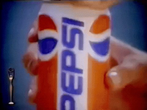
1980s–1990s: when Pepsi became pop culture
Cue neon lights, denim jackets, and Michael Jackson. Pepsi embraced boldness, turning its globe icon into a cultural statement. This version was kinetic — it felt alive, modern, and perfectly aligned with youth marketing. The brand wasn’t just selling soda; it was selling energy.
2000s–2010s: digital minimalism and global recognition
The early 2000s brought 3D gloss, gradients, and “wet look” effects to suit emerging digital platforms. But as screens evolved, clarity became king. The 2010s saw Pepsi simplify again, proving that in design, evolution often loops back to simplicity.
Typography, colour, and the globe motif — what defines each era
From ornate curls to bold sans-serifs, typography told Pepsi’s story of progress. The globe icon — now one of the most recognisable shapes on Earth — evolved too, representing both motion and inclusivity. Even colour psychology played a role: red for energy, blue for trust, white for purity.
Design principles change, but consistency builds legacy. At White Rabbit, that’s our approach too — we modernise logos without erasing their history, keeping familiarity intact while updating the design DNA.

Old Pepsi logo vs new — what’s changed and why it matters
If you’ve ever compared the old Pepsi logo vs new, you’ll notice it’s not about reinvention — it’s about refinement. Each redesign builds on what came before, adjusting just enough to stay fresh without alienating fans.
The 2023 Pepsi logo redesign explained
In 2023, Pepsi revealed a bold new look — or should we say, an old one reborn. The wordmark moved back inside the globe, the black outline returned, and the blue deepened to a near-electric tone. The vibe? Retro-futuristic.
Inside Pepsi’s redesign process
Led by PepsiCo’s Chief Design Officer Mauro Porcini, the Pepsi logo redesign was about blending heritage with digital readiness. Every curve and hue was tested for legibility across packaging, social, and screen displays. It’s the kind of thoughtful detail that separates a facelift from a full rebrand.
At White Rabbit, we follow a similar rabbit trail — integrating branding, digital, and packaging design so that your logo works everywhere, from business cards to billboards.
From 3D realism to flat design: why brands simplify
Why did Pepsi ditch gradients and depth? Simple: digital clarity. Flat design can scale seamlessly across devices and reads better on mobile. It’s efficient, elegant, and future-proof — everything a 21st-century brand should be.
Balancing nostalgia and modern appeal
The new design’s secret weapon is emotional connection. By tapping into the nostalgia of the 1990s while streamlining for 2025, Pepsi managed to charm both millennials and Gen Z. It’s proof that brand memory is powerful currency — one you can’t fake.
What the old school Pepsi logo teaches us about branding in 2025
Branding isn’t static. It’s a living thing that grows, adapts, and occasionally does a dramatic wardrobe change. The Pepsi logo change shows that brands don’t need to start from scratch — they just need to evolve strategically.
Nostalgia marketing and timeless design
Nostalgia sells — not because people want to live in the past, but because they trust what feels familiar. Brands like Nike and Lego lean into their heritage just as Pepsi does. It’s comfort wrapped in creativity.
The shift toward responsive logos and digital versatility
A logo today must perform everywhere — from desktop to smartphone to 3D packaging. Responsive design ensures legibility and adaptability, which is why scalable vector systems are the new industry norm.
At White Rabbit, we ensure every logo — whether minimalist or detailed — functions seamlessly across mediums, staying crisp no matter where it appears.
How legacy brands stay relevant in a fast-changing market
The best brands maintain clarity, story, and adaptability. They know when to pivot and when to pause. That’s what keeps Pepsi from becoming a museum piece. For smaller brands, it’s about planning evolution before necessity forces it.
What small businesses can learn from the old school Pepsi logo
You don’t need Pepsi’s budget to learn from its brilliance. Whether you’re rebranding your café or relaunching your e-commerce store, the same principles apply.
How to modernise your brand without losing recognition
Start with your core identity. Keep recognisable elements — colours, shapes, or motifs — and update structure, typography, or composition. It’s not about change for change’s sake; it’s about sharpening what’s already strong.
At White Rabbit, our logo design process is built on evolution, not erasure. We retain what your audience loves while adding the polish that keeps your brand fresh.
The value of strategic rebranding vs reactive redesign
Rebranding should always be proactive — done with purpose, not panic. Pepsi’s redesigns were driven by cultural shifts, not declining sales. Small businesses should follow suit: research, plan, and test before unveiling something new.
Why working with a full-service design agency makes the difference
Instead of juggling multiple suppliers, working with a single creative burrow like White Rabbit ensures cohesion. From brochure design to packaging design, our projects hop seamlessly between mediums while maintaining one visual voice.
Ready to refresh your logo? Work with White Rabbit NZ
One agency, endless design expertise
We’re a full-service design agency with senior creatives skilled in everything from brand identity to digital storytelling. You get a unified strategy, creative execution, and a consistent design language across every channel.
Seamless project management
Our signature White Rabbit BurrowBlueprint™ design process ensures clear communication and structured revisions — no disappearing acts or mysterious file versions. You’ll always know where your project stands (and who’s holding the carrot). And if your brand just needs a full bunny makeover, we can refresh your logo or visual identity while still keeping a respectful nod to what already makes it unique.
Start your brand evolution with our senior design team
Let’s give your brand a glow-up worthy of Pepsi. Contact us to start your project today — and let’s make your logo one your audience will never forget.